Website development technology is a very multifaceted process. But nevertheless, all its stages can be divided into two main components - functionality and the outer shell. Or, as is customary among webmasters, back-end and front-end, respectively. People who order their websites from web development studios often naively believe that it is worth focusing only on the functionality, and this will be the right decision. But this is true in very, very rare cases, usually for startup projects at the beta testing stage. Otherwise, the graphic design and user interface are simply required to comply with web development standards and be convenient.
The first cornerstone faced by an interface designer or designer is the width of the site layout. After all, it is necessary to draw interfaces for it. Purely intuitively, two approaches arise - either to make separate layouts for each popular screen resolution, or to create one version of the site for all displays. And both options will be wrong, but first things first.
The standard width of the site in pixels for runet
Before the development of adaptive layout, a mass phenomenon was the development of a site with a width of a thousand pixels. This figure was chosen for one simple reason - that the site fits on any screen. And this has its own logic, but let's assume that nevertheless, a person has at least an HD monitor on the desktop. In this case, your layout will seem like a tiny strip in the middle of the screen, where everything is stuck together in one pile, and on the sides there is a huge unused space. Now let's assume that a person came to your website from a tablet with a screen of 800 pixels in width, and in the settings there is a check mark "Show the full version of the website." In this case, your site will also be displayed incorrectly, as it simply will not fit into the screen.
From these considerations, we can conclude that a fixed width for the layout does not exactly suit us and we need to look for another way. Let's analyze the idea of a separate layout for each screen width.
Layouts for all occasions
If you have chosen as a strategy to create layouts for all screen sizes on the market, then your site will become the most unique on the entire Internet. After all, it is simply impossible today to cover the entire range of devices, trying to make fine tuning for each option. But if you focus on the most popular resolutions of monitors and device screens, then the idea is not bad. Its only minus is financial costs. After all, when the interface designer, designer and layout designer will be forced to do the same work 5 or 6 times, the project will cost disproportionately more than the price originally budgeted for.
Therefore, boasting an abundance of versions for different screens can only single-page sites whose purpose is to sell one product and be sure to do it well. Well, if you do not have one of these landing pages, but a multi-page site, then it’s worth discussing further.
Most popular site sizes
The trade-off between the two extremes is to render the layout for three or four screen sizes. Among them, one must be a layout for mobile devices. The rest should be adapted for the small, medium and large desktop screen. How to choose the width of the site? Below are the statistics of the HotLog service for May 2017, which shows us the distribution of the popularity of various device screen resolutions, as well as the dynamics of this indicator.
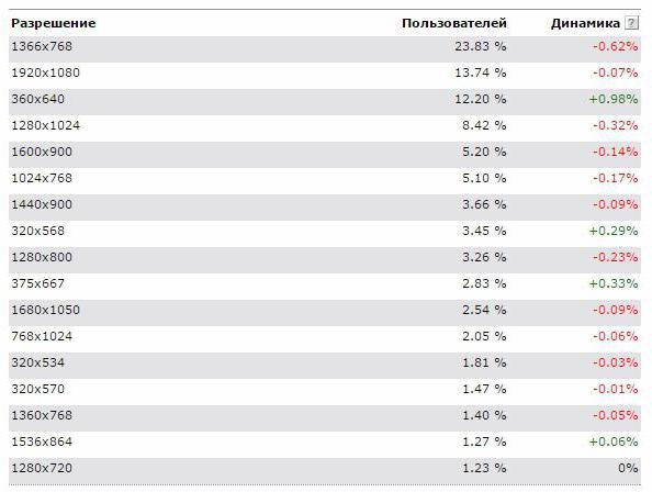
From the table you can find out how to determine the size of the site that you want to use. In addition, we can conclude that the most common format today is a 1366 screen with 768 pixels. Such screens are installed in budget laptops, so their popularity is natural. The next most popular is the Full HD monitor, which is the gold standard for videos, games, and, therefore, for creating site layouts. Further in the table we see the resolution of 360 mobile devices at 640 pixels, as well as various options for desktop and mobile screens after it.
Designing a layout
So, after analyzing the statistics, we can conclude that the optimal width of the site has 4 variations:
- Notebook version with a width of 1366 pixels.
- Full HD version.
- A layout of 800 pixels wide for display on small desktop monitors.
- The mobile version of the site is 360 pixels wide.
Suppose we’ve decided which size to use for creating the source code for the site. But such a project will still be costly. So consider another options, this time without using a fixed width.
Making the layout flexible
There is an alternative approach, when it’s worth adjusting only to the minimum screen size, and the sizes of sites themselves will be set in percent. At the same time, such interface elements as menus, buttons and logo can be set in absolute values, focusing on the minimum size of the screen width in pixels. Blocks with content, by contrast, will stretch according to the indicated percentages of the width of the screen area. This approach allows you to stop perceiving the size of sites as restrictions for the designer and to talentfully beat this nuance.
What is the golden ratio, and how to apply it to the layout of web pages?
Even in the Renaissance, many architects and artists tried to give their creations an ideal shape and proportion. For answers to questions about the meanings of such a proportion, they turned to the queen of all sciences - mathematics.
Ever since antiquity, a proportion was invented, which our eye perceives as the most natural and elegant, because it is found everywhere in nature. The discoverer of the formula for such a ratio was a talented ancient Greek architect named Phidias. He calculated that if the majority of the proportion refers to the smaller, as the whole relates to the larger, then such a proportion will look best. But this is the case if you want to split the object asymmetrically. This proportion was later called the Golden Ratio, which still does not overestimate its significance for world cultural history.
Back to web design
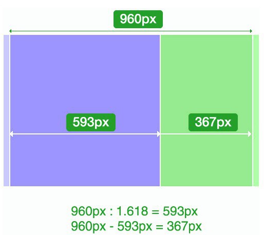
Everything is very simple - using the golden ratio, you can design pages that will be as pleasing to the human eye as possible. Calculating the definition of the golden ratio formula, we get the irrational number 1.6180339887 ..., but for convenience you can use the rounded value of 1.62. This will mean that the blocks of our page should be 62% and 38% of the whole, regardless of what size of the source code you create for the site you are using. An example you can see in this diagram:
Use new technologies
Modern website layout technologies allow you to accurately convey the ideas of the designer and the designer, so now you can afford to implement more ambitious ideas than at the dawn of Internet technology. You no longer have to rack your brains hard over what the size of the site should be. With the advent of such things as adaptive block layout, dynamic loading of content and fonts, website development has become much more pleasant. Indeed, such technologies have fewer restrictions, although they nevertheless are. But as you know, without limitations there would be no art. We suggest you use one truly creative design approach - the golden ratio. With it, you can efficiently and beautifully fill the workspace, no matter what site sizes you specify in your templates.
How to increase the workspace of the site
It is likely that you will not have enough space to fit all the elements of the interface into a small layout. In this case, you have to start thinking creatively or even more creatively than you did before.
You can free up space on the site as much as possible by hiding navigation in a pop-up menu. It is logical to use this approach not only on mobile devices, but also on desktops. After all, the user does not need to constantly look at what categories are on your site - he came for content. And user desires need to be respected.
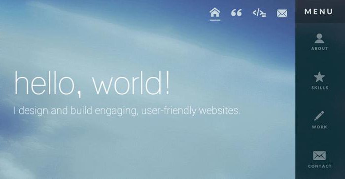
An example of a good way to hide the menu is the following layout (photo below).
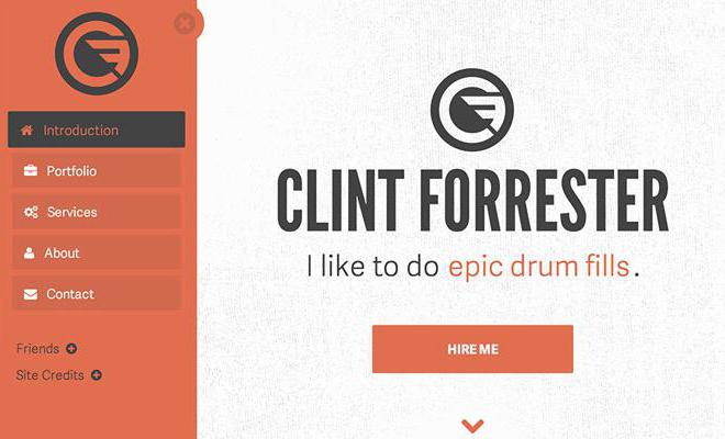
In the upper corner of the red area you can see a cross, clicking on which will hide the menu in a small icon, leaving the user alone with the content of the website.
However, this is not necessary, you can leave the navigation, which will always be in sight. But you can make this a beautiful design element, and not just a list of popular links on the site. Use intuitive icons in addition to or even instead of text links. It will also allow your site to make better use of the screen space on the user's device.
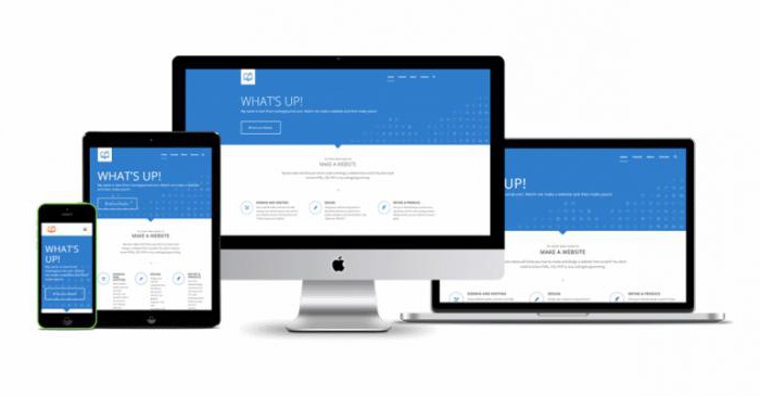
Best Website - Responsive
If you do not know which layout to choose for the site, then everything is simple for you. To save on development costs and at the same time not to lose the audience due to poor layout for some device, use adaptive design.
Adaptive is a design that looks equally good on different devices. This approach will allow your site to be understandable and convenient even on a laptop, even on a tablet, even on a smartphone. This effect is achieved due to automatic changes in the width of the working area of the screen. Using adaptive style sheets for the site, you make the right decision possible. 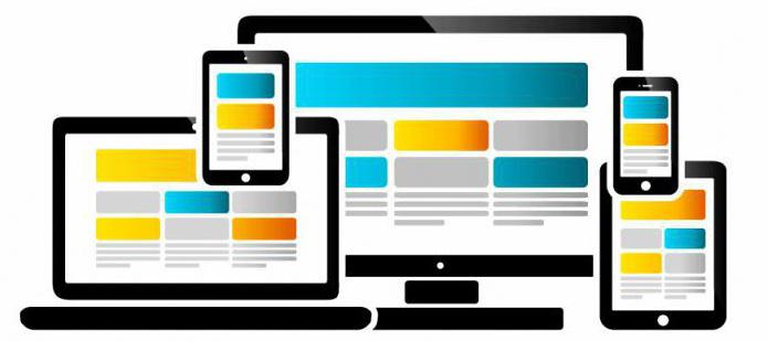
What is the difference between responsive design and the availability of different versions of the site
Responsive design differs from the mobile version of the site in that in the latter case, the user receives an html-code that is different from the desktop. This is a drawback in terms of optimizing server performance, as well as search engine optimization. In addition, it becomes more difficult to read statistics for different versions of the site. The adaptive approach is free from such disadvantages.
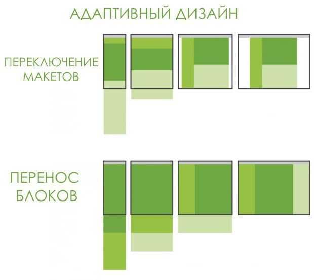
Adaptability for various devices is achieved through a layout with a percentage width setting either by transferring the blocks to the available space (in the vertical plane on the smartphone instead of horizontal on the desktop), or by creating individual layouts for different screens.
You can learn more about responsive design and its development from textbooks.