How to stand out among competitors with the help of a logo, attract attention, remember customers, but not look too strange at the same time? In this article, we will understand the main reasons for the success of coffee logos and determine the basic rules for creating bright, memorable logos.
The brightness and surprise of logos as the key to success
Coffee brands most often choose natural food colors for their logos, namely a variety of brown and green shades, white color is used as the basis. People tend to associate green with intimacy with nature, and brown with coffee itself . White color, in turn, implies purity and lightness.
In order to stand out among its direct competitors, you can resort to bright colors. Such coffee logos are perceived brightly, but at the same time organically, which is impossible not to notice on the product market. The approach to creating a logo when bright color is used is a great example of the original style and the desire to stand out against the general background.
The unexpected elements on the logo also promise the company success. Most often , coffee cup emblems , coffee packaging and other promotional items contain coffee beans or small coffee cups, but because of this, most companies become similar to each other. In order to ensure originality of your logo, it’s enough to forget about patterns and think more broadly - for example, instead of coffee beans, draw a clock, a ship, a child’s profile, an owl or something else.
Non-standard form and unusual style
Have you noticed that with most coffee brands coffee logos are depicted in the shape of a circle or oval, or do not have any specific shape at all? This is quite justified, because the coffee cup is round, and the grain is oval. But it’s worth the risk and try to create a logo of any other form. For example, a square, triangle or hexagon. In addition, do not forget about this type of logo as a text one - this is a great way to give customers the opportunity to immediately remember the name. Use minimalism, heraldry, lettering and experiment with colors, because you need to first show your attitude to what you are working on, and not just demonstrate the finished product.
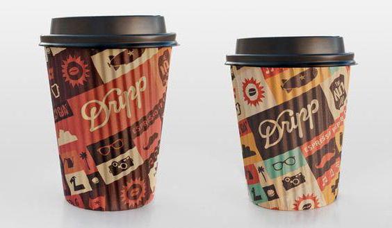
Stylistics plays a big role in shaping the image of your product and the coffee logo. Bet on the image, combine the company’s corporate identity and logo with a unique idea. This will definitely make your brand perception deeper and more trusting. For example, you can use the style of the USSR, the Wild West, Hollywood, and so on.
The centuries-old history of the Jacobs brand and its logo
The Jacobs coffee brand has a history that spans several centuries, and it began in 1895 with the opening by Johann Jacobs of a tiny biscuit, chocolate, tea, cocoa and coffee shop in Bremen. It was the coffee beans that Jacobs sold that became popular, and soon Johan moved to the shopping street, then the most popular in Bremen. In 1906, a coffee bean roasting factory was founded, and after 7 years, the Jacobs trademark was registered as a brand.
Over the long history of Jacobs coffee, the company logo has undergone numerous changes, while remaining recognizable to the audience. Now the logo is textual with stylistic impregnations - the brand name is on a golden background, and steam rises above the first letter, like a cup of coffee, and in the center of the gold ribbon is a crown, based on coffee bean. Behind the gold ribbon, without leaving the crown, there is a velvet-green background, successfully harmonizing with the entire logo.