April 1, 1976, Steve Jobs and Steve Wozniak founded Apple. Today, after 41 years, it is difficult to find a person who would not hear about her. The company, which presented the world with a mouse, trackpad and user graphic interface, did not fully reveal the secrets of the origin of its logo - a bitten apple.
The Apple logo helped make the brand the way it is today. A modern user knows what a company’s brand looks like, and some even remember a rainbow-colored apple that adorns the gray Mac. But when it comes to why Apple has a bitten apple - their logo, many are forced to admit that they don’t know the correct answer to this question.
What does an apple have to do with it?
It seems that even now no one fully understands why the company was named Apple. Hardly anyone associates computers with an apple. The history of the appearance of such an unusual brand symbol has overgrown with myths and legends. Because Steve Jobs worked at an apple farm in the summer of 1975? Or is it all about his love for the Beatles (their recording studio was called Apple Records)? Or he just liked Macintosh apples.
How the logo story began
Few people know, but in 1976 Apple had a different logo. It depicted Newton resting under an apple tree. Such a brand name did not look at all stylish and was not suitable for use in small sizes. If you look at the instructions for Apple I (the very first computer of the company), you can see this very complex logo.
So why does Apple have a bitten apple - their logo? The answer to the question is rooted in 1976, when the brand was just born. Anyone who is even a little interested in modern technology knows that Apple was founded by Steve Jobs and Steve Wozniak. In fact, the company had three, and not two, as is commonly believed, the founders - Steve Jobs, Steve Wozniak and the lesser-known Ron Wayne. The latter gave up his stake in the company less than two weeks after its creation. Now Ron admits that he saw a successful future for the young company, but does not regret his choice. And if he had the opportunity to change his mind, he would do the same.
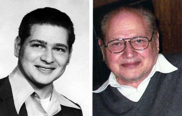
The reason for rejecting a 10% stake in a promising company lies in Ron's negative past experience and his unwillingness to take risks. At the very beginning, Apple received an order for 50 computers. In order to collect them, it was required to borrow $ 15,000. Wayne heard that the customer company is known for the difficulty in paying money to suppliers. Already elderly (43 years old), Ron did not want to take risks, getting involved in deals with the possibility of losing all his property. Unlike both Steves, he had his own house and car.
It was Ron Wayne at the beginning of the company's founding who drew the first brand name - the image of the brilliant Isaac Newton reading a book under an apple tree.
The appearance of the famous logo
The logo appeared shortly before the release of Apple II. The history of its occurrence began in April 1977. Steve Jobs turned to Rob Janov, a middle-aged designer at Regis McKenna Advertising. Then a lot of companies predicted a failure if they left the previous logo. He was too intelligent and not suitable for depicting him in small sizes. According to Michael Morritz, author of The Little Kingdom: A Private History of Apple Computer, Steve Jobs really believed that the logo might be one of the reasons for Apple I’s poor sales. He became interested and spent several days looking at apples bought from a different angle from a nearby store . As a result, the designer came to the conclusion that simplicity is the key to success, and painted a logo in the form of a monochrome bitten apple.
Rainbow apple
Jobs liked the idea, but he insisted that the logo be color, despite all the attempts by the head of the advertising company to dissuade him because of too much printing costs. By the way, all the attacks of the company's founders, claiming that Yanov borrowed the idea of a color logo from the notorious rainbow flag, have no foundation - the symbol of sex minorities began to be used by the community only in 1979. However, it is believed that it was the similarity of the flags that caused the logo to change color in 1998. A bitten apple became what it was originally intended to be - monochrome.
"For the colorful stripes on the first logo, there was also a practical reason: Apple II was the first personal computer that could reproduce color images on the monitor," Yanov explained.
The most expensive logo
Steve Jobs was responsible for most of the work on creating the logo. The difficulty was to print it in several colors, located next to each other. Four known at that time color printing technologies in several stages left the risk that the layers could be shifted and would overlap each other. Yanov suggested separating the layers with thin black lines. This would solve the problem and reduce the cost of printing. However, Steve Jobs firmly decided - the logo should be without stripes. For this reason, Michael M. Scott of Apple called it "the damn expensive logo ever created."
It is noteworthy that for his legendary work Rob Yanov did not receive a penny. “They didn’t even send cards,” he said in an interview. Steve Jobs managed to establish excellent relations with the chief marketer of Silicon Valley, and he allowed the developing company to use the services of his subordinates for free.
Bitten Apple Apple
According to Linsmeier, Rob Janov started with the silhouette of a black apple on a white background, but felt that something was missing. The pun, which Apple had previously used in advertising for Apple I, prompted Yanov to bite an apple (“bite” in English translates as “bite” and pronounced as computer “byte”).
“A bitten apple means that the logo also no longer resembles a tomato, cherry or any other fruit,” Yanov said.
Bill Kelly, also with Regis McKenna Advertising, remembers a different story. He says that a bitten apple is a symbol of temptation and the acquisition of knowledge (referring to the biblical tree of knowledge). A hint of how modern technology helps humanity to learn and develop faster, but at the same time making it more and more dependent on them.
Alan Turing inspired Apple?
In 1954, computer scientist and brilliant mathematician Alan Turing died after he bit an apple with cyanide. For a long time, it was thought that this suicide was probably due to chemical castration, which the British government imposed on him after confessing to sexual relations with a man. Although it is now assumed that Turing's suicide was not deliberate. He often neglected his experiments and could well accidentally inhale cyanide or put an apple in a pool of cyanide.
Whatever happens, the bitten apple was found at Turing's bed. Two decades later, two guys started making computers in their garage. They knew about Turing's contribution to programming and computer science and decided to honor his memory. And the world received a landmark logo.
According to the designer who created the logo of Rob Janov, this beautiful story does not apply to reality. “This is just a wonderful urban legend,” he said in 2009. Other theories - a reference to the first woman Eve to bite a forbidden fruit or discover Newton's gravity - are also erroneous.
However, when actor Stephen Fry once asked his good friend Steve Jobs if the famous logo was related to the Turing apple, Jobs replied: "God, we would like it to be like that."
What does a bitten apple mean for Apple?
The true reason for the birth of such an unusual brand name remains a mystery even for Apple employees. On the other hand, such an abundance of legends around this gives a special mystery to the history of the logo, allowing each user to interpret it in their own way.
According to an employee of Apple, Jean-Louis Gasier, this is precisely his splendor: “Our logo reflects at the same time passion and disorder, intelligence and hope. We could not even dream of the best. ” Today, no one dares to deny that a memorable and simple at first glance icon played a crucial role in the development of the brand.