Beginner typesetters often have difficulty positioning elements through CSS . In fact, the CSS Position property is much easier to learn than it seems at first glance. Having mastered it, you will get a powerful tool with which you can arrange all the elements of the page in the right places. But in order to achieve a result, you need to know about all the existing values, since the principles of their action are very different
The specifics of building a document flow
Position CSS works with webpage flow. How to understand this? By default, all page elements are arranged in the order in which you created them in the html markup. If the header tag is located above the footer tag , then on the page it will be displayed above. And vice versa, if for some reason you decide to place the footer in html above the header, the footer of the page will be displayed above the header. In this case, the block elements occupy the entire width available to them. Lowercase, in turn, are arranged on one line until they occupy it all, and then begin to be transferred to a new one. This order is referred to as the “document flow”.
To change the flow behavior, use the Position property. in CSS . It may also change due to the float property , but we will not consider it. Using positioning, you can make an element “drop out” of a regular stream, after which it will begin to behave in a new way. How exactly - depends on the property value used.
CSS Position: static
Position: static, or static positioning, is the default value for all html blocks you created. Under normal circumstances, you do not have to deal with it. If for any block or line no positioning is specified at all, then it has the value static. On the page, such a component is displayed according to the flow. If you specify the properties right / left or top / bottom, there will be no effect.
CSS Position: fixed
When using this property, the element is outside the normal flow of the document. Now its position is calculated relative to the browser window, regardless of how other components are placed. In other words, a block with Position : fixed will go to the top of the page, cling to the edge of the browser window, and other elements will take its place in accordance with the stream.
The main feature of fixedly positioned elements is that they can overlap other blocks and lines of the page. When scrolling, a block with Position : fixed will seem to remain in place without disappearing from the screen. This is useful if you need to make navigation or a similar element that the user should always have access to. Fixed positioning is also used if you want to place the quick scroll button in a specific part of the page.
CSS Position: relative
Using this property is called relative positioning . If you set the element property Position : relative, that will remain in its place. At first glance, nothing special will happen, but everything will change if the right / left and top / bottom properties are additionally used . With their help, you can control the movement of the component relative to its location. In the place where the block or line was before, there will be empty space - other elements will remain in their positions, not paying attention to the vacated space .
When moving the component does not affect the position of the surrounding parts of the page. They will remain in their places, although a relatively positioned block can block them. The property itself is rarely used. Usually it is used in combination with the following option.
Absolute positioning
One of the most interesting and most commonly used options. When using the Position property with a value of absolute, the position of the page component will be calculated relative to the browser window. Other elements (which are not absolutely positioned) seem to “forget” about the existence of a “brother” with Position : absolute and take its place in the stream. It would seem that everything is exactly the same as in the case with Position : fixed, but there are serious differences.
Firstly, the position of the element can be freely controlled - for this, the properties top / right / bottom / left are used. For example, if you set bottom : 100px, the block will “ push off” 100 pixels from the bottom of the page. Secondly, when scrolling, the “absolute” component will remain in its place, instead of moving with the page.
Absolute Block Interaction with Parent Elements
You can achieve even more precise control over an absolutely positioned component. To do this, you need to set its parent property Position : fixed, relative or absolute.
Consider an example. You have a div with a relative-div class , inside which is placed a div with an absolute-div class . We set the Position : absolute property of the inner block . He immediately “flies” from the stream and is somewhere above, because now its location is calculated relative to the browser window. Now set the block with the relative-div class the Position : relative property and the “prodigal son” returns to its place. Nearly. In fact, it appears in the upper left corner of the parent element.
Why it happens? The point is the specificity of the Position : absolute property . By default, its position depends on the browser window, but if the “parent” is also positioned somehow other than static, the position begins to depend on the parent element. This is very convenient, because you can place the component anywhere without calculating huge numbers relative to the browser window. Reception is often used to place icons, buttons, and other small elements.
Center CSS Position
One of the main difficulties for beginners is to center the element vertically and horizontally. Properly using the Position property , to make this easier than ever. CSS Position: absolute in the center is set as follows. Suppose you have d iv with the absolute-div class , which is in a “diva” with the relative-div class . The "parent" is positioned relative to and its width is equal to the width of the entire page. The Descendant has a width and height of 400 px, absolute positioning and is located by default in the upper left corner of the parent element.
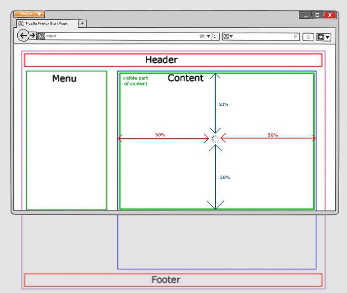
All you need to do is set the absolute component top: 50% and left: 50%. Almost ready! Absolute-div moved and was almost in the center, but not quite. The midpoints of the “parent” touch its edge, and we need the center of the “descendant” to be in the center of the block. To do this, set margin-left and margin-right with values -200 px. Thus, we will shift the absolutely positioned block to half its height and width. Everything, he is in the center!
Component overlap
The problem may be a difficult, at first glance, “overlay” positioned elements on their “neighbors”. For example, a component with Position : fixed will overlap everything on the page. The situation can be corrected using the z-index property , however, remember that it only works for positioned elements. Accordingly, if you want to place a block on top of a fixed positioned element, this block will also have to specify positioning. For example, relative.
The best way to master positioning is to look at Position CSS examples , experiment and try your own. Try to learn how to use it in combination with the calc () function - this will provide an opportunity to more flexibly configure the location. However, remember that this property is not intended to build the entire "grid" of the page. With it, you need to move relatively small elements, otherwise you can get confused too easily.